Starbucks for Android Redesign
Onboarding

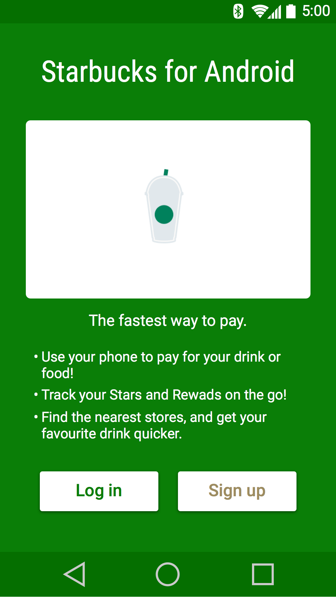
- Simple and straightforward presentation.
- It shows a Starbucks card, followed by a short list of what the app’s functions, and the expected login and signup buttons.
- I used Android Lollipop’s new ability to colour every part of the app to reflect branding, including the status and navigation bars. This extends the brand of the image.
While a navigation drawer hidden by a hamburger button is a favourite nowadays, I chose to stay with the tabbed navigation - three or four items in a whole drawer didn’t make much sense, and the visibility of a tabbed navigation seemed more appropriate for an app with only three screens.
Home Screen

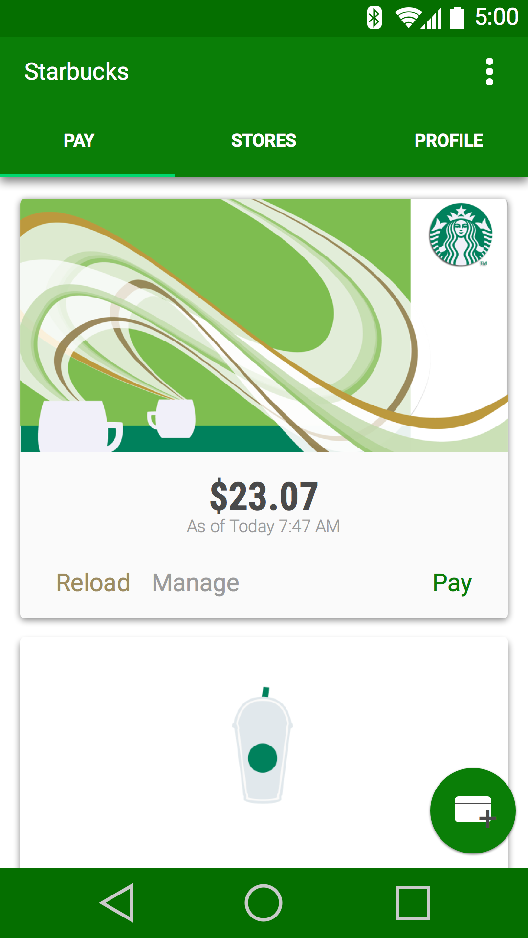
In the redesign, I use a vertical list of cards. As in the Material guidelines, each card has actionable buttons for “Reload”, “Manage”, and “Pay”.
- The “Add a Card” action is a floating action button in the bottom right. The button has a drop shadow to give it an effect of floating above other elements to signify its importance.
Stores Map Screen

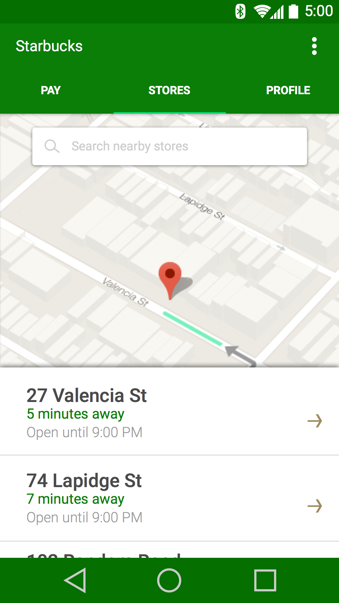
- I adapted the look here and changed a few things to abide by the Googliness that Android apps were meant to have.
- A list of stores accompanying the map of POIs are the central attention, with an added detail for distance and amount of time away from a certain store. It’s a more user-friendly look that gives them enough information to see which store to go to, while not drowning the user with unnecessary, ugly details.
“Rewards” and Profile Screen

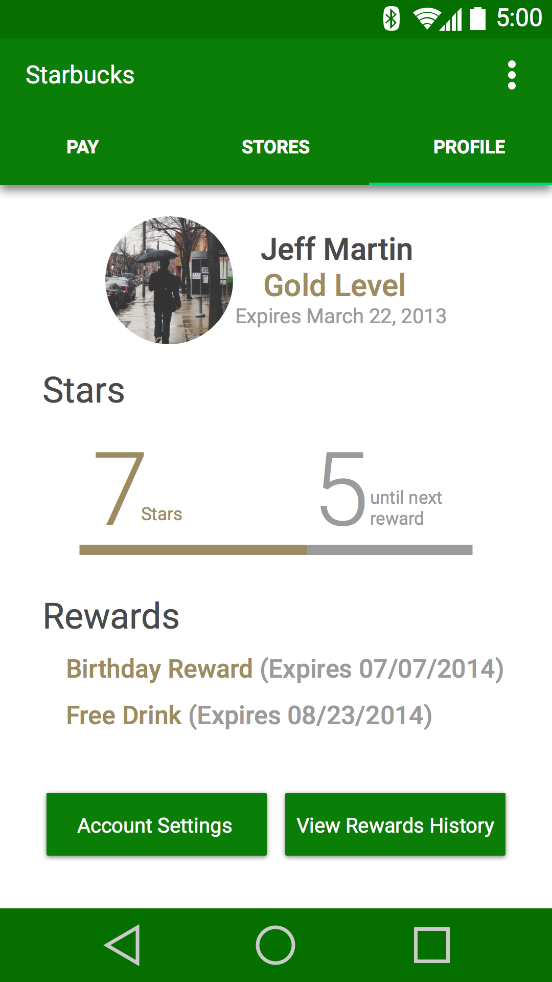
I designed this screen around the idea that Starbucks should to show information like your name, reward status, and star progress in a cleaner way.